
5.1 Charts, Layouts And Axes
Basic Display Control:
From the main toolbar select layout and decide the format that will best be used to map your data.
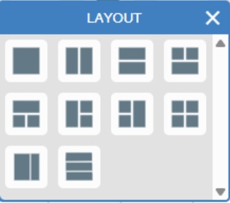
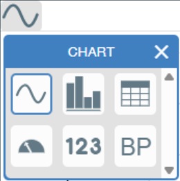
Up to four charts can be open at one time and they can be any combination of sensors and display type. They are Graph/Line, Table, Numeric, and Dial. There is a special fifth option, BP for Blood Pressure work using the appropriate sensor.
The Chart selection can be made in the top left of each chart. Tap or click here to select the type of chart to display e.g. line graph, bar graph, table, dial, numeric and Blood Pressure B.P.
With a layout of four displays, EasySense looks like this: Continuous top left,
Numbers top right,
Table bottom left,
Meters bottom right.
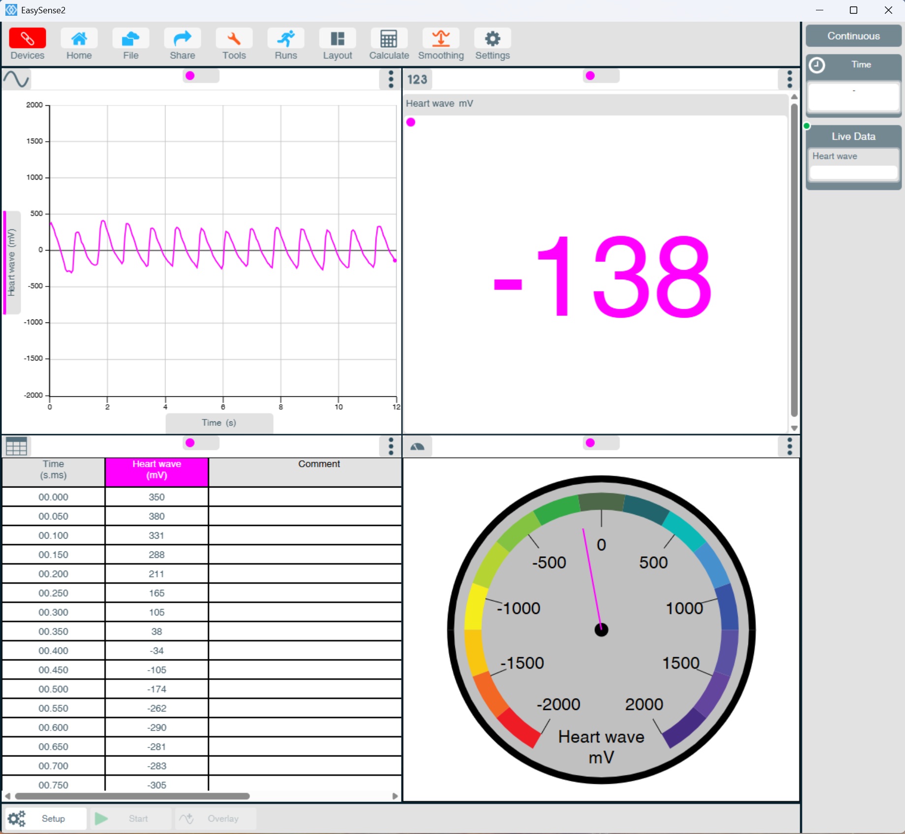
Let's concentrate on the Continuous display, top left.
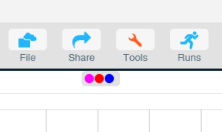
The colour circle in the data series box corresponds to the colour of the plotted line and displayed data.
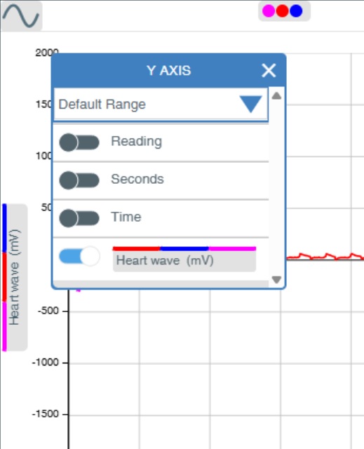
Tap or click Y-axis and to Auto-scale data (top left chart, left hand side).
Tap or click here to change the X-axis display (Time, top left) from Time to Reading number on both graph and table charts.